
If your website traffic looks great but your sales are crawling, the problem might be your landing page—not your product.
You see, it’s not just about getting people to your site. It’s about getting them to take action.
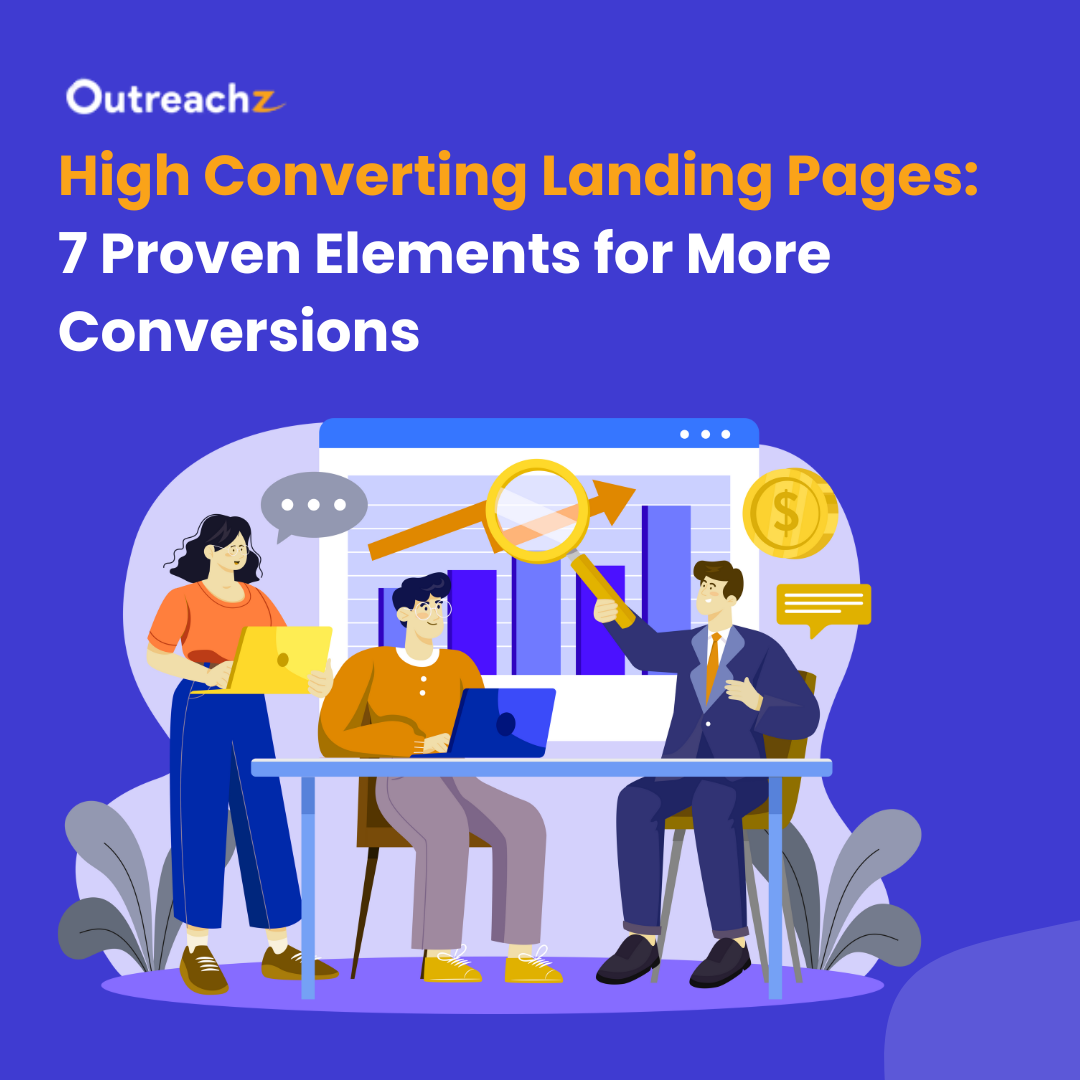
That’s where high converting landing pages come in. These are not your average web pages. They’re specifically designed to do one thing really well: convert visitors into leads or customers.
In this guide, we’ll break down 7 proven elements that make a landing page work like a charm.
What Makes a Landing Page High Converting?
First things first—what even qualifies a landing page as “high converting”?
A high converting landing page is a page that convinces a large percentage of its visitors to take a specific action. That action might be filling out a form, signing up for a trial, making a purchase, or clicking through to another step in your funnel.
According to HubSpot, the average landing page conversion rate across all industries is approximately 5.89%, with 10% considered a good benchmark. However, well-optimized landing pages can achieve conversion rates of 10% or more, with top performers reaching up to 20% or higher. This significant difference underscores the importance of optimization—especially when running paid ads, where maximizing conversions is crucial.
But what gets a page to that level?
It’s not luck. It’s structure.
Let’s look at the core building blocks that repeatedly show up in the best-performing pages.
Top 7 Proven Elements of a High Converting Landing Page
1. A Headline That Grabs Attention Instantly
People judge your page in seconds. If your headline doesn’t make them want to stick around, they’re gone.
Your headline is the first conversion lever. It should:
- Clearly explain what you’re offering
- Speak directly to your audience’s pain point or desire
- Spark curiosity, urgency, or emotion
For example:
“Get 3x More Leads in 30 Days—Without Hiring a Sales Team”
“Tired of Slow Websites? Boost Your Speed in 5 Minutes”
Each one is specific. Direct. Outcome-focused.
Pro tip: Always test multiple headline variants. Even a small change in phrasing can boost your conversions dramatically.
2. A Clean, Value-Focused Subheadline
The subheadline does the supporting work. If the headline gets attention, the subheadline needs to hold it.
Your goal here is to reinforce your main benefit or offer more clarity. Avoid being clever—be clear.
Example:
“Our AI-powered platform helps marketers optimize every campaign with zero code.”
This is also where you can introduce credibility or address objections subtly.
By naturally incorporating these LSI keywords into your copy, you make your content more relevant to both users and search engines, improving both readability and SEO.
3. Visuals That Speak Louder Than Words
Humans are visual creatures. In fact, the brain processes images 60,000 times faster than text. So your hero image or explainer video is doing heavy lifting.
Make sure your visual:
- Matches the offer
- Evokes emotion or context
- Is high-quality (no generic stock!)
- Works well on both desktop and mobile
For SaaS or services, short demo videos work wonders. For physical products, lifestyle shots often perform better than plain product photos.
Remember: people buy based on emotion, then justify with logic. Visuals can trigger that emotion faster than any headline.
4. Write Copy That Connects (Not Confuses)
Most landing pages don’t fail because of design—they fail because of confusing, bloated copy.
Your copy has one job: guide the reader to act.
And to do that, it must answer three core questions immediately:
- What is this?
- Why should I care?
- What do I do next?
Keep it clear, concise, and benefit-driven. Use short paragraphs, bold subheadings, and bullet points to make your message easy to scan—especially on mobile.
Here’s the difference between average copy and high-converting copy:
“Our software uses predictive algorithms.”
vs.
“Know what your customer wants—before they do.”
The first explains a feature. The second sells an outcome.
Skip the jargon. Talk like a real person. And most importantly—match your tone to the reader’s awareness level:
- If they’re new to your brand: keep it simple and clear.
- If they’re problem-aware: be direct, confident, and persuasive.
Because the best copy doesn’t just explain—it makes people feel understood.
5. One Strong, Clear Call to Action (CTA)
You’d be surprised how many landing pages forget this part.
Your call to action is where the magic happens. It’s the gateway to conversion.
Don’t make users guess. Tell them what to do.
And don’t clutter the page with five different buttons going in five different directions.
Stick to one goal, and make it clear.
Great CTAs use actionable verbs and highlight value:
- “Start My Free Trial”
- “Get the Checklist”
- “Book My Demo”
- “Join the Waitlist”
Make your button stand out visually. Use contrast and whitespace to draw attention. Repeat your CTA at least twice: once above the fold and once after explaining benefits.
This is the tipping point between bounce and conversion. Treat it with care.
6. Social Proof That Builds Instant Trust
People tend to believe real experiences more than polished brand promises. That’s why showcasing social proof is one of the most powerful ways to build trust on your landing page.
Use:
- Customer testimonials (with photos or video, if possible)
- Star ratings and reviews
- Case studies or success stories
- Trust badges and client logos
- Numbers that impress: “Used by 10,000+ marketers” or “4.8/5 rating on G2”
Don’t fake it. Real proof beats manufactured hype every time.
If you have none yet, try pulling a quote from a beta user or early client. Even one authentic voice makes a difference.
7. Seamless UX: Speed, Mobile, and Simplicity
You can have the perfect copy, beautiful visuals, and all the right CTAs. But if your page loads slow, looks bad on mobile, or feels overwhelming—you’re losing money.
Speed matters. According to Google, even a 1-second delay can reduce conversions by 20%.
Here’s how to tighten up your landing page experience:
- Compress images
- Use responsive design
- Cut unnecessary content or distractions
- Remove top nav bars if not essential
- Prioritize mobile layout and usability
Also, pay attention to form design. Fewer fields = higher completion rates. Only ask what you truly need.
High converting landing pages feel frictionless. Everything should move the user toward the CTA without confusion or delay.
Let’s Recap: The 7 Essentials
If you want a landing page that converts like crazy, make sure it includes:
- A compelling headline
- A clear, supportive subheadline
- Visuals that connect
- Copy that’s simple and persuasive
- One strong CTA
- Trust-building social proof
- A smooth, optimized user experience
These are the fundamentals. Ignore them, and your page will leak conversions.
But if you follow them—and keep testing—you’ll quickly see the difference in your results.
Advanced Tactics to Boost Landing Page Conversions Even Further
Once you’ve nailed the basics, it’s time to add layers of sophistication. These aren’t just “nice-to-haves.” For brands in competitive spaces, they’re often what move the needle from good to great.
Let’s explore a few next-level conversion techniques.
1. Use Psychological Triggers (Ethically)
People don’t always make decisions logically. They often decide emotionally—and quickly.
By using tried-and-tested psychological triggers, you can gently guide users toward conversion.
Here are a few that work exceptionally well:
- Scarcity: “Only 12 seats left for the webinar”
- Urgency: “Offer expires in 4 hours”
- Social proof: “4,500 people downloaded this guide last week”
- Authority: Featuring endorsements or credentials
- Reciprocity: “We’re giving this free checklist—just enter your email”
Subtle use of these elements adds persuasion without being manipulative.
2. Personalization Based on Behavior or Source
Not all visitors are created equal—and your landing page shouldn’t treat them like they are.
Personalize your:
- Headline
- Copy tone
- CTA language
- Visuals
- Offer type
For example:
- A cold visitor from a Google ad should see messaging that directly reflects their search query.
- A warm lead from email might get a bolder offer or deeper content.
- Someone who’s already downloaded a lead magnet can see a new step in the funnel, not a repeat.
Tools like Unbounce, VWO, Instapage, or even dynamic UTM parameter handling let you personalize without complex dev work.
Relevance increases conversions. It’s that simple.
3. A/B Test Every Key Element
What works for one audience may flop for another—and you won’t know until you test.
Don’t assume. Test and prove.
Start by testing:
- Different headline variants
- CTA button copy and colors
- Short vs. long forms
- Pages with vs. without video or testimonials
Important: Only test one variable at a time. That’s the core of effective A/B testing — learning exactly what drives the change, not just that something changed.
4. Add Interactive Elements
Engagement increases trust and attention span. Interactive landing pages are more memorable and effective.
Consider:
- Quizzes (e.g., “What’s your marketing strength?”)
- ROI calculators
- Live chats or AI chatbots
- Hover effects and animated CTA buttons
- Scroll-triggered animations
These micro-interactions can increase time on page and deepen user involvement, both of which signal relevance to search engines.
5. Use Exit-Intent Popups Wisely
Yes, they can be annoying. But when used with care, exit popups can save conversions that would otherwise be lost.
Trigger them right before a user is about to leave and offer something they can’t ignore:
- A limited-time discount
- A free downloadable
- A last-chance reminder or CTA
Example:
“Wait! Don’t leave empty-handed—download our free landing page checklist now.”
Keep it relevant. Keep it valuable.
Common Mistakes That Kill Landing Page Conversions
Even with the right elements, some missteps can completely derail your efforts. Avoid these conversion-killing mistakes at all costs.
1. Too Many Distractions
The whole point of a landing page is to keep the user focused on one goal. Avoid:
- Navigation menus
- Multiple CTAs for different offers
- Unnecessary links
Every extra option is an opportunity to bounce.
2. Weak or Vague Messaging
If visitors can’t figure out what you’re offering — or why it matters — in a few seconds, they’re gone.
Make your value proposition crystal clear.
3. Not Mobile-Optimized
Over 60% of users visit landing pages from mobile devices. If your page isn’t responsive or takes too long to load, your conversions will tank.
Always preview and test on multiple screen sizes.
4. Asking for Too Much Too Soon
A cold lead probably won’t give you a phone number, budget, company name, and job title right away.
Start small — name and email. Then nurture them.
5. Ignoring Analytics
You can’t improve what you don’t measure.
Use tools like:
- Google Analytics (set up goals and conversion tracking)
- Hotjar or Crazy Egg (heatmaps, session recordings)
- Facebook Pixel (for remarketing data)
These tools tell you where users are dropping off, what they’re clicking on, and what’s working.
Top Tools to Build and Test Landing Pages
You don’t need to start from scratch or guess what works. The right tools can help you build professional landing pages and continuously improve them based on real user data.
Here’s a refined set of tools, grouped by what they do best:
1. Landing Page Builders
These tools let you design high converting landing pages quickly — no coding needed.
- Unbounce – Ideal for marketers who want fast A/B testing and conversion-focused templates. Great for running campaigns and optimizing on the fly.
- Leadpages – Affordable and beginner-friendly, with a large library of ready-to-use templates.
- Webflow – Offers advanced design flexibility and animations, great if you want more creative control.
2. A/B Testing and Analytics
Knowing what’s working (and what’s not) is key to higher conversions.
- Google Optimize – Easily test variations and integrate results with Google Analytics.
- VWO – More robust testing with heatmaps, user behavior tracking, and split testing.
3. User Behavior Insights
Understanding how users interact with your page helps you improve layout and content.
- Hotjar – Provides heatmaps, scroll tracking, and session recordings to see how users engage.
- Crazy Egg – Similar to Hotjar, with additional features like click tracking and A/B testing.
4. Feedback and Lead Management
These tools help you capture leads effectively and improve your offer based on real feedback.
- Survicate – Add quick, non-intrusive surveys to gather insights directly from visitors.
- HubSpot – Great for managing leads, tracking user behavior, and delivering personalized content.
These tools not only save time — they help you make informed decisions, test smart, and continuously improve your landing page performance.
High Converting Landing Page Examples
Let’s break down a few real examples from top brands that consistently get this right.
1. Shopify’s Free Trial Page
Why it works:
- Single headline with clear benefit: “Try Shopify free for 3 days.”
- Clean design with just one form field (email)
- Testimonials from real customers
- Minimal distractions, mobile-friendly
Takeaway: Keep it simple. Reduce friction at every step.
Source: https://www.shopify.com/
2. Dropbox Business
Why it works:
- Beautiful visuals showing teams using Dropbox
- Clear CTA: “Get started for free”
- Alternating sections of benefit copy and product screenshots
- Reinforces trust with brand logos like Under Armour and Expedia
Takeaway: Visual context + recognizable clients = instant credibility

Source: https://www.dropbox.com/
Final Thoughts
The difference between a landing page that works and one that flops? Intentional design and constant improvement.
Building a high converting landing page is not just about following trends or copying competitors. It’s about understanding your audience — what they care about, what they fear, and what will make them act.
Every scroll, every click, and every word matters. But you don’t have to get everything perfect on day one. Start with the seven proven elements shared above, use the right tools, and keep testing.
Remember — traffic is expensive. Don’t waste it on landing pages that don’t convert.
When you optimize your landing page, you don’t just get more conversions — you get better leads, higher ROI, and faster growth.
FAQs
1. What makes a landing page high converting?
A high converting landing page grabs attention with a compelling headline, presents a clear value, and uses persuasive copy and visuals to guide users toward a single call to action (CTA).
2. How do I know if my landing page is converting well?
Track your conversion rate. If it’s higher than the industry average (around 5%), you’re on the right track. Use tools like Google Analytics or heatmaps to see how users are interacting.
3. Should I include multiple CTAs on my landing page?
No. A single, focused CTA works best. Too many options can confuse visitors and reduce conversions. Stick to one clear action.
4. How important is mobile optimization for landing pages?
Very important! With over 60% of users browsing on mobile, a responsive design ensures your landing page is easy to navigate and convert on all devices.
5. Can adding social proof improve my landing page conversions?
Yes! Testimonials, reviews, and client logos build trust and credibility, making visitors more likely to take action.